It can be great to recieve requests for cards, but they always come with a certain amount of apprehension. What if they don't like it? It's one thing to give away a card for a birthday or something, but to sell it? Well. I've decided to just go with it and try to fulfil their requests as best as I can! This card draws inspiration from several cards she liked and I hope she's pleased with the result.
-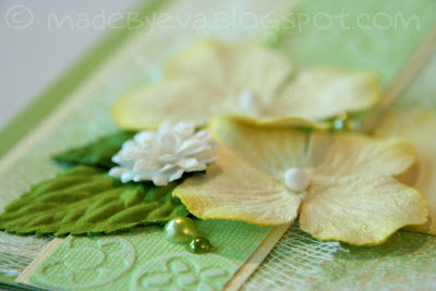
A few flowers and leaves are complimented by scattered flat-backed pearls in two tones. There's also some embossed and sanded Core'dinations cardstock, cheese cloth and green Glimmermist.
 Now this is something I've never done before: A surfing themed wedding card! Hmm. How to approach this challenge... I must admit I spent quite a while thinking about this one. In the end, I went with graphic papers representing waves and sand rather than photographic ones in order to make the card slightly more stylish. The two surfing boards are there on the suggestion by the person who has ordered the card. Well, the surfing thing can definitely be checked off the list, but what about the wedding thing? I'v included a few hearts here and there, but is it enough? I don't know... I don't quite know what to make of this card. Am I pleased or not? That depends on when you ask me - it changes all the time.
 The little details here were essential in making these appear as surf boards and not tomb stones. Some tweaking was required... Several times. Another thing that helped in that regard was using my Prisma pencils to give the surf boards a sort of shaded midline, an illusion suggesting a 3D shape.


 The greeting is stamped on a die-cut and sanded piece of Core'dinations Whitewash, and framed by a simple arrangment of my trusted Prima flowers. I was tempted to glitter them up, but as I was making two cards for this occation I decided to have one with glitter, one without. You'll soon see the other (heavily glittered) one that I made... ;) Remember to bring your sunglasses.