 Who said vintage had to be brown and dingy? I'm not saying this is a classic vintage card, but it's close enough, right? The colours were taken from the image - light blue as the flower in her hair, and light pink as her lovely dress. The papers are, of course, by the ever lovely Maja Design! Few embellishments other than the flowers from Papirloftet, some Prima bling swirls and the QK Phoebe letters, but it really doesn't need more.
Monday, May 31, 2010
Bright vintage card for Hege
Who said vintage had to be brown and dingy? I'm not saying this is a classic vintage card, but it's close enough, right? The colours were taken from the image - light blue as the flower in her hair, and light pink as her lovely dress. The papers are, of course, by the ever lovely Maja Design! Few embellishments other than the flowers from Papirloftet, some Prima bling swirls and the QK Phoebe letters, but it really doesn't need more.
Saturday, May 29, 2010
A little taste of heaven
There's no better reason to have a go at a delightful butterscotch recipe than finding a carton of double cream about to expire in your fridge... :) That sort of removed any guilt that might have arisen when dishing out lots of cream, butter and sugar. It had to be used, right? It's not my fault that it just begged to be used on something so amazingly tasty as butterscotch sause? Right? Anyone? *grinning wildly*
-
 You can find the original recipe on Smitten Kitchen, but I've rewritten it for you using metric measurements. I always find it a little tricky to measure butter by the cup... Be aware that my recipe is also about double the size. I find it more convenient to not have half a carton of double cream left over, but it also makes for a whooole lot of butterscotch... :P
-
You need:
150 g unsalted butter
3,3 dl (= ca 280 g) packed brown sugar
3,3 dl double cream
ca 1 ts flaky salt (or 1/2 ts of regular salt), or to taste
ca 4 ts vanilla extract, or to taste
-
 Melt the butter on medium heat. Add sugar, cream and salt. Stir while it all melts and blends together. Resist the urge to pour it in a cup and drink it right away.
-

 I recommend letting the butterscotch cool to room temperature before serving. It's not really a must, but when hot it is very runny! If it is allowed too cool it becomes more viscous - in fact, if you leave it in the fridge for storage (and it must definitely be kept in the fridge for the week or two you can store it) it can become semi-solid. Just leave it on the counter for a while before serving, or heat it very slightly if you're the impatient type.
-

-
 You can find the original recipe on Smitten Kitchen, but I've rewritten it for you using metric measurements. I always find it a little tricky to measure butter by the cup... Be aware that my recipe is also about double the size. I find it more convenient to not have half a carton of double cream left over, but it also makes for a whooole lot of butterscotch... :P
-
You need:
150 g unsalted butter
3,3 dl (= ca 280 g) packed brown sugar
3,3 dl double cream
ca 1 ts flaky salt (or 1/2 ts of regular salt), or to taste
ca 4 ts vanilla extract, or to taste
-
 Melt the butter on medium heat. Add sugar, cream and salt. Stir while it all melts and blends together. Resist the urge to pour it in a cup and drink it right away.
-

Let simmer carefully for about five minutes while stirring now and then. That's right, there's no need for a sugar thermometer or a cold water test to get it right. Just let it bubble away for those five minutes and rest assured that it will all be ok.
-
Remove from heat, add vanilla extract and stir well. And this is where the magic happens. The strength of your salt and vanilla extract may differ from others, so don't skip this part. Fill a teaspoon with butterscotch and taste it - very carefully, as it's still very hot! Then add more salt or vanilla extract, or both, depending on taste and preference. Stir well and taste again. I usually end up adding a little bit of salt and a couple of teaspoons of vanilla extract. The salt gives the butterscotch that unique zingy taste, and the vanilla is, well, pure vanilla heaven.
-
I recommend letting the butterscotch cool to room temperature before serving. It's not really a must, but when hot it is very runny! If it is allowed too cool it becomes more viscous - in fact, if you leave it in the fridge for storage (and it must definitely be kept in the fridge for the week or two you can store it) it can become semi-solid. Just leave it on the counter for a while before serving, or heat it very slightly if you're the impatient type.-

When I read this post at Smitten Kitchen I knew I just had to try this. Anything that inspires such vivid and passionate writing has to be good, right? And let me tell you, she was not kidding. This sauce is amazing. Nothing I can write can do it justice, it's just that good. I want to sip it straight from the bottle. Not to mention how it tastes on ice cream! Yum. Or try it on fresh or baked fruit. Don't take my word for it, give it a try for yourself, it's incredibly simple. Now there's a new addiction for you (I mean me). :P And if you think you have more than enough, how about making it a gift? Just be sure to tell the recipients to consume it within a week or so. Enjoy!
-
Friday, May 28, 2010
These are the days
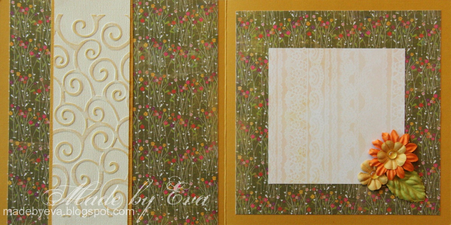
 I kind of feel like this card lacks a focal point or something... There's just something missing. But oh well, it's done now and I'm not ripping it apart. ;) The papers are BG Green at Heart and Porcelain, the flowers and leaves are mostly Prima, rub-ons from Creative Inspirations. The horizontal panel is Core'dinations Whitewash embossed in the CB and slightly sanded to reveal the yellow core.
-

Colourful on the inside too, but I might add a suitable sentiment on the left side when I figure out who the card will go to...
Thursday, May 27, 2010
New baby girl to love
 A while back I attended a scrap gathering in the basement of my local paper craft store, HobbyHimmelen. I've only had the chance to do it once before, and I love it! In fact, I was the first to arrive and the last to leave. Oh yes, I'm a dedicated card maker. ;) The cards haven't appeared before now because of the sheer number of cards and other projects I've made lately...
-
This was my first card of the day. As you might see, I've cracked open my new BG Kioshi 6"x6" pad. Gorgeous! It's been paired with an overlay from the 29th Street Market line and flowers, brads and flat-backed pearls from my stash. There's actually a little baby feet charm hidden in that big cluster, you'll see it if you look closely.
-
 I've used leftovers and scraps for the inside, and will probably add a sentiment or the baby's name on the left side before sending this card. I didn't bring any stamps at all to the gathering. A tough choice, but it saves me a lot of room, and I get to use some of my neglected rub-ons and other text options instead.
Wednesday, May 26, 2010
Gro Sofie 29 years
 After struggling for ages to find apricot coloured papers in my stash I finally gave up and pleaded my friend for a different colour suggestion... White, silver and pale pink was her second choice, and what a relief. Those are colours I have more than enough of. ;) What kind of colour is apricot anyway? Everything I had was eiter too pink or too orange...
-
The big white flower is from North Star Stamps, the other flowers and leaves from Kort og Godt and Prima. Silver spacers and flat-backed pearls seemed like an obvious choice to complement the colours in the silver printed vellum and pink paper. The center panel is Core'dinations Whitewash cardstock embossed with my CB and sanded to reveal its core colour. I stamped the text "You are the world's greatest!" in Distress Tattered Rose on pink cardstock to mimic watermark stamping, and I think it looks ok now. That was one of my friend's requirements for this card, but in my excitement of having workable colours again I almost forgot about the whole thing, silly me.
-
 Lots and lots of flowers - large and small, buds and in full bloom. I love making these clusters, and keeping it in white and pale pink colours made this one so light and airy. If you think attatching vellum is a chore, here's a tip for you: if your vellum has a printed pattern that is completely opaque (like this one), it's possible to put a tiny dab of glue directly under the pattern without it showing on the front!
Tuesday, May 25, 2010
Why don't I make more cards like this?
 Sometimes the best crafting supplies don't come from the place you most expect. The papers used in this card actually come from Panduro. I associate them more with simple crafting kits with all sorts of other matierials, and although they've expanded into paper crafting, I haven't found anything particularly interesting there. But these papers, oh these papers!! The embossed silver one is shiny, thick and looks awesome when cut and embossed with Spellbinders. And the flowery paper, I can't possibly convey in words and pictures how wonderful it is! It's so thin you can see through it, and seems more like fabric than paper. The base is perfectly matte and impossibly black. It has then been letterpressed with an incredibly shiny deep red colour - and the result is simply stunning!
-
The clean and simple layout was chosen to give the luxurious papers their chance to shine. What looks like a grey mat is actually a sligthly sparkly silver carstock - it added just the right amount of lightness to the otherwise dark colour scheme. And although this kind of card never photographs well, trust me when I say that, up close and personal, it is just amazing.
-
 Some dimention was achieved in the card by inserting the black Bazzill flower under the sentiment, and using 3D cusions to raise the other corners a little. The Kort og Godt roses always make a statement. The colours and general layout are actually inspired by the December 4th 12"x12" layout I made for my advent calender last year. How it's taken me so long to make a card in the same style is a mystery. ;) I think we often shy away from the dark colours fearing a depressing, funeral-like card - but done right, dark colours can be really striking and luxurious, almost budoir-style.
-
 "Friends have a wonderful way of reminding us what really matters." Text stamp by my favourite, Penny Black. The inside and last page of the card was kept in the same style - and I love it to bits... :)
Monday, May 24, 2010
Another one for Merete and Ruben
 Most of my wedding cards are white with either gold or silver accents. So how did I manage to make two green wedding cards for the same couple? Fortunately the cards don't have too many other similarities. ;)
-
I had a completely different plan for this card, but every single thing I did to it changed what was possible (or desirable) and the plan was revised so many times there was no plan at all in the end! I'm still not quite happy with it. The DP is from the always excellent Maja Designs, just slightly covered with some white linen weave Magic Mesh. It's too pretty to hide! :) I love those big flowers from Papirloftet, they make such a statement. And that lovely heart stamp set is awesome. But can anyone tell me why it's impossible to leave the Liquid Pearls alone until it's completely dry? I tell myself to be patient, but fail to keep my hands off it every time. *rolling eyes* Next time, maybe next time... ;)
Saturday, May 22, 2010
Merete and Ruben's wedding card
 This one was made so long ago I'm not even sure when... I just uploaded the picture to a post so I wouldn't forget it, but when it was time to hit "publish" I suddenly realised I hadn't actually written anything. Oops. ;) Congratulations, Merete and Ruben, I hope you're enjoying your big day!
-
I had a kraft paper addiction at one point, and teaming it with crisp white and spring green always looks great! I've got to go buy some more now, that's for sure. Other materials include the always wonderful MS border punches, Creative Inspirations rub-ons, QK heart and Phoebe alphabet, flowers and charms from stash.
Friday, May 21, 2010
House warming present (and sneak peek)
 I suppose it's more traditional to bring flowers as a house warming present, but I just have to be weird I guess. ;) This is a little jar that used to hold a delicious spicy red pesto, now filled with my homemade butterscotch sauce. Made with my homemade vanilla extract. Ah, the joy of putting my crafting to good use. :)
-
The decoration is super simple this time - just a circle of pink and white fabric tied with ribbon. The little crown charm is the finishing touch, and it is simply suspended from the ribbon in a jump ring right next to the tied bow. I've upcycled a couple of jars with paper embellishments before, but much prefer this. Using fabric makes me think of grandmothers and old strawberry jam jars and warm summer days...
-
I know I promised a butterscotch sauce post. I will write one. It takes all my strength of will to not devour the jar I have in my fridge right now, like a five-year-old on a serious sugar high, but I will manage to photograph it first. There - I've written it and now I have no choice but to do it. ;)
Thursday, May 20, 2010
Simple DIY water reservoir

I have, somehow, amazingly, managed to keep two green potted plants alive in my appartment for the last five years. Don't ask me how. If my experience is anything to go by, it helps to nearly kill them every now and then. ;) This one looks a bit pitiable from this angle, but it's actually a hanging plant that has now reached 60 cm in length! The main problem I have with my plants, especially in the coming hotter months, is that they often dry out very thoroughly and it's very difficult to bring moisture back into the core of the soil. The water seeps into the outer few millimetres and everything inside is bone dry. What to do...
-
Enter DIY solution: test tube core watering reservoir!
-
 All you need is a plastic test tube or something similar, and something sharp to make holes. My test tube contained embossing powder that I had already moved to a wider jar. I then made little holes at regular intervals, from just over the bottom of the test tube to about 1,5cm from the top. It is a good idea to keep the holes as small as possible, and to space them evenly so no one area of soil gets too much water.
-
Carefully make a hole into the soil and insert the test tube, as close to the center as you can without damaging the roots. Or just jam it in there, like I did. ;) Best to do this on an occation where the soil is actually quite moist, so that there's no need for a jackhammer. Fill tube with water and see how the water is drawn into the soil where it's most needed: in the middle!
-
-
 The holes I made turned out to be a little big, so the water seeps out a little faster than I'd prefer. I decided, though, that the important thing was that the water would be delivered where I wanted, and it is. :) If you manage to make smaller holes than what I did, it might be an idea to keep the cork on hand if you had one. This is especially handy if you find some longer test tubes that can be just partially inserted into the soil. That way you can fill your reservoir to the top, cap it tight to prevent evaporation, and you have a longer-term watering system in place! I had some long test tubes that used to hold vanilla pods, but they were impossible to pierce without breaking either the tube or the point - or both.
-
Well, I wish us all the best of luck with our potted plants, and hope that they all survive the summer without permanent ill effects. I like to think I'm giving my plants a fair chance this year. :)
Wednesday, May 19, 2010
In high gear
 My mojo is working in high gear these days apparently! This card just fell together on my desk almost by itself. :) And by the time this one is posted, I'll have one post scheduled every day for nearly three weeks, most of them card posts! The cards will pop up as the various events have taken place and the recipients have recieved their cards... :)
-
And would you look at that - FOUR different DPs on one card! From four different sources! Ok, so three of them are almost solid colours, but still. I'm very pleased. :P The papers are BG (Green at heart/Archaic/Lime Rickey) and PaperLoft (Back Country). Prima CB digits, Tim Holtz circle tag, the rest from stash. Bold and simple - I think it suits the recipient, an out-doorsy-working-man kind of guy...
Tuesday, May 18, 2010
Tsumami Kanzashi National Day brooch
 Is brooch the right word for this? Sometimes I can't figure out even the simplest English words. ;) Well, you see what I mean, it's a good thing we have pictures in our posts, right? :)
-
 The colours of the Norwegian flag are - as you may already know or have guessed - red, white and blue. Substitute any colour (if necessary) to make a kanzashi brooch for your own National Day! :) After my kanzashi sunflower brooches I thought a little about other things I could make along those lines. I whipped this one up in the late hours on Sunday, just in time for the big celebration yesterday. I also have several other kanzashi project ideas, they make excellent projects for lazy summer days in the sun!
-
 I improvised a folding technique at the end of these fabric strips, and to my surprise they look pretty good! The fold is just secured with ordinary craft glue - there was no time for sewing, and really no need for it either. I haven't even ironed the folds, and just stuck some double-sided tape along the fabric strip to hold it together! I covered an old button with red fabric and just glued it to the center of the flower.
-


Monday, May 17, 2010
Congratulations!
 To all Norwegians everywhere: Happy National Day!
-
Eat lots of ice cream -
with a ton of bananas, peanuts and chocolate sauce poured over.
I know I will. ;)
Watch the parades, the children and the fireworks.
And, most importantly,
enjoy your day!
Sunday, May 16, 2010
Revive – revisit – relive
 Remember this autumnal post from last October? It seems just right to celebrate spring with a look at that same chalkboard sign. I love that someone (it's the same hand writing as before, I'm sure of it) is dilligently measuring away despite summer still being months away!
-
 There's wind enough to make wild pictures of trees, but this time it's the growing pussy willow that's the star of the show, not the yellowing birch.
-

Friday, May 14, 2010
Warning: colour bomb!

I hope you have your sunglasses within easy reach ladies, 'cause this one's bright!! :) It looks like a whole paintball team went nuts and expended its entire arsenal on that little 15x15 cm space! Oh MY. I had a sudden and irresitable urge for colour the other day and totally went with it. Pardon me if your screens just groaned and died trying hopelessly to display this circus of colours. ;)
-


The inside's not much better, haha... So keep those sunglasses on! The dominating red colour, as well as the metal apples on the front, were the starting point for the card. The recipients has just moved to Apple Street, so I thought that was fitting.
Below is a photo of the very simple last page - but have a look at those stamps. Finding a decent white ink pad has been on my list for a while, and I think my search is finally over! This is the Elzybells pigment ink pad and it is awesome. Check out the coverage and clarity in in all those tiny little lines! If you're interested, there's more info on the Elzybells blog.
-
So, to the family that just moved to Apple Street, you have the honour of recieving my craziest card yet. :) Enjoy!
Wednesday, May 12, 2010
Marianne 31 years
 I had completely forgotten to make Randi's daughter, Marianne, a card for her birthday this year! Shame on me. But better late than never, right? Since I would meet them both in Randi's birthday I thought I'd make them matching cards. The fact that I had very very very little time to make these two cards may possibly have had a little influence on that fact. Just a little. ;)
-
BG Kioshi DPs (love them!), Bazzill and Prima flowers, white Scrapper's Floss and an owl charm from stash. Although I love the MS border punches (who doesn't?), I seem to have some problems with this one. Perhaps the guidelines on the punch has been misprinted, but it doesn't seem so. I'm going to cut my paper 2mm shorter than the guide says next time to see if I can get it to match up better. As it is here, it looks so bad I nearly had to make another one then and there. Also, my apologies for the crooked photo. Right angles seem to present difficulties to me these days.
-
 Quickly Photoshopped (or rather, "PhotoStudioed") to remove what I had already written when I shot this photo. The sentiment is a part of the BG Kioshi Pieces bag I bought along with the 12"x12" Kioshi papers, aren't they just lovely? When I later came across Kioshi in a 6"x6" pad I couldn't resist it and bought that too. Expect to see more of it!
Monday, May 10, 2010
Randi 60 years (again?)
 It's been almost half a year since I posted the first card for Randi's 60th birthday, but this weekend was the big celebration and I've made one to give myself this time. This was one of those cards that went in exactly the direction I intended, and came together really quickly. What a relief to spend three quarters of an hour on a card instead of three whole hours! Obviously, I'm not a very fast card maker... ;) I guess it helps that this is just a slightly more advanced version of a layout I've done lots and lots of times before. Lovely BG papers (Sugar Rush/Nook and Pantry).
-
 I've decided to start documenting the inside of my cards more often - it's impossible to remember what text stamps I use when if I don't. I probably won't show many here on my blog, though, as most of them are pretty boring. This is actually a fairly elaborate one for me, that should say it all. ;) But after spending hours on the front page I have little patience left for the inside!
Saturday, May 8, 2010
Love story
 Wedding season is rapidly approaching, and the orders have started coming already. This one is a little different than most of the wedding cards I've done, and I have to say I quite like it!
-
The two Tim Holtz tickets were leftovers from two previous cards. I just put them next to each other on my memory board for future use, and suddenly realised they were a perfect match for a wedding card! Happy accident. :)
-
I used copper coloured Magic Mesh instead of a DP, so I could keep the red colour but tone it down a little. The heart shape is by Creative Imaginations. The roses are from Kort og Godt and Papirloftet. While I love the look, they're so big that it's going to be a challenge to cram the card into the envelope! ;) The ornament swirls are CB dies, and the names are in my beloved QK Eliza mini letters. At a slant - again... Note to self: find a better technique.
Thursday, May 6, 2010
A latte for Maiken
 I recently mentioned that the DCVW Latte stack is among my absolute favourites. Imagine my joy then, to get a request for it again! :) It's another card for a confirmand, so I wanted to give it some differences from the last one. Not that she'll ever notice - unless she comes to visit me here of course. :P
The big Prima flower was just a touch too pink, but that was soon fixed with a couple of shots of Glimermist Frost. I've layered it on a paper doily and one of my precious Bazzill flowers that are out of production... A few lilac Papirloftet flower buds and some white Scrapper's Floss later, and the large flower stack was done. I've had the metal leaf in my stash forever, but the "journey" tag is by Tim Holtz. The letters are QK Katie classic outlined by a Sakura gellyroll pen.
Tuesday, May 4, 2010
Baby card in favourite colour combo
 I've been busy in the card making department lately, but the only one I dare to show you is this one! I know it's going across the pond (you know, that big one, called the Atlantic ocean) and I'm pretty sure the recipients aren't regular visitors here. The other four finished cards will have to lie buried among my scheduled posts for a while still. Maybe I'll have forgotten all about them by the time they pop up...
-
Blue and brown is one of my favourite colour combos. I consider it much too nice to be reserved just for the guys, but in the case of babies they indicate the gender pretty clearly. The quote tag comes from 7Gypsies and I love it! It came along with a whole bunch of tags with all sorts of family related quotes and proverbs printed on them. Absolutely fantastic! The papers are Maja Design and Ladybug and Friends, the ticket from Tim Holtz. A swirly Stempelglede stamp managed to sneak its way in under the Magic Mesh. The image is coloured softly with Prismas as usual and cut out using my oval nesties.
Sunday, May 2, 2010
New crafting supplies in action
 There's nothing like a weekend away with friends shopping crafting supplies by the bucketload! It's already been two weeks since the opening of Bikuben's new store and the paper crafting fair Scraporama. I've used some of my new stuff on my latest cards, but this one is where this year's shopping theme really shows. You see, I went nuts in the 7 Gypsies and Tim Holtz sections this time... :) And finally couldn't resist putting it to good use!
-
The card is made from kraft cardstock (note to self: by more - again) with a full-sized 7 Gypsies overlay attatched. A couple of stamps and a Tim Holtz ticket lie underneath it, and the QK Katie letters and TH metal tag over it. A few brads and some baker's twine hold the whole thing together. It photographs badly due to the shiny overlay, but looks pretty good in reality. It opens a new style possibility for those dreaded man's cards, and I wouldn't mind using it for women either!
Subscribe to:
Posts (Atom)


