Showing posts with label wedding. Show all posts
Showing posts with label wedding. Show all posts
Thursday, October 9, 2014
A fragment
Friday, February 14, 2014
On this important day

Wednesday, September 26, 2012
Another wedding card

In contrast to my previous wedding card, this one sports rough teared paper edges and a completely different colour scheme. The recipients of this card aren't the pink and frilly type, so it was a good match - but that happened entirely by accident! This was a commissioned card and I had no idea who I was making it for, so I took a chance and was very lucky. :) That cool blue and gold paper is by Panduro, and I swiped some blue StazOn ink over the Prima chipboard letters.
Monday, September 24, 2012
For the bride and groom
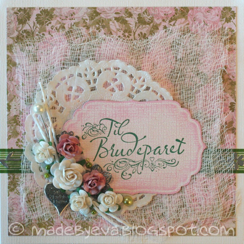
Wedding season is winding down and I have a couple of cards to share. This one is cute and pink and frilly! Pretty basic layout. I love that placement of flowers, and have lately developed a bit of an obsession with adding lots of flat-backed pearls among them. The sentiment is stamped on die-cut and sanded Core'dinations Whitewash cardstock.
Monday, July 30, 2012
Reuse, reduce, recycle

Wednesday, July 25, 2012
Too late to take a new picture now!

Wednesday, May 16, 2012
The wedding standard

Whenever I get a request for a wedding card, I immediately reach for the white and silver cardstock. It's the silver standard, so to say, for my wedding cards. This one came together quite quickly for that reason - no tricky colours to match or contrast, no long hunts for that perfectly coloured embellishment. Neutrals I've got. ;) The layout is also very familiar by now... Three cheers for effectivity!
Sunday, November 20, 2011
Surf's up!
 Now this is something I've never done before: A surfing themed wedding card! Hmm. How to approach this challenge... I must admit I spent quite a while thinking about this one. In the end, I went with graphic papers representing waves and sand rather than photographic ones in order to make the card slightly more stylish. The two surfing boards are there on the suggestion by the person who has ordered the card. Well, the surfing thing can definitely be checked off the list, but what about the wedding thing? I'v included a few hearts here and there, but is it enough? I don't know... I don't quite know what to make of this card. Am I pleased or not? That depends on when you ask me - it changes all the time.
 The little details here were essential in making these appear as surf boards and not tomb stones. Some tweaking was required... Several times. Another thing that helped in that regard was using my Prisma pencils to give the surf boards a sort of shaded midline, an illusion suggesting a 3D shape.
Friday, September 16, 2011
For Eva and Olav
 While this isn't technically a repeat of my previous card, I certainly drew inspiration from it. Quite necessary too, as this was a card I had... sort of forgotten. *ahem* And I had to whip this one in a hurry, late at night. Similar materials, slight variations in layout. The metal heart is a paperclip I painted with Gesso, wiped carefully to reveal its silver core, and sealed with a layer of Glossy Accents.
Tuesday, September 13, 2011
Wedding card
 By some miracle, my desk is now starting to appear beneath the half-meter layer of paper and stuff it's been buried under for the last months. I've still got some tidying to do, but I'm already finding a new drive to make cards. It could have something to do with the rain outside as well of course, but I'm betting the
 Thursday, July 7, 2011
Long long time ago...
 A long long time ago, I used to make cards. Like this one, a wedding card that's been waiting patiently to be posted. And then some other projects engulfed me and the card making desk was loaded with more ane more stuff, and never tidied. Like Sleeping Beauty's castle, it's covered in an impenetrable wall of entangled stuff. I'm still waiting for the inspiration to tear down that wall and reveal a shiny, tidy desk that invites me to sit down and create something out of paper. Right now, in the middle of summer vacation and on the home stretch of a big big sewing project, I doubt it will happen any time soon. But some day, some day, I'll get around to it. Because I can feel the itch in my fingers now and then. As tactile as yarn and fabrics are, there's something uniqely wonderful about the smell of new paper...
 Tuesday, February 22, 2011
White wedding
 Most of my wedding cards are white with one accent colour - but I've been wanting to do an all-white wedding card for a while. Now, that's a bit tricky, especially when there are supposed to be readable names on it, but I just couldn't resist. I was a bit apprehensive with my first result, added glitter and still didn't quite like it, so I added another layer - and more glitter... Too much of a good thing is wonderful - right?
-
 Since there's no colour variation here, I made the card all about texture, structure and glitter. I embossed some white cardstock and layered it with white Magic Mesh and two intertwined QK hearts and splurged on a huge Prima flower complete with pearl center and feathers. Matting the Bazzil Bling with another layer of white cardstock was a simple trick to create a frame without using colour. White on white on white! ...on white on white on white on - well you get the point. :P The letters and corner swirl got a liberal coating of Glossy Accents to give them more dimension and help them stand out from the background.
-
 When in doubt, add glitter. Does glitter count as a colour? Because in that case, this is no longer just a white card. There's enough glitter on this thing to warrant the use of strong sunglasses for sure. Not only does Stickles Star Dust cover the embossed cardstock, the flower, the corner swirl and the edges of the cardstock, but there's also the dominant use of Bazzil Bling, and if that's not enough, I doused the whole thing with heaps of Glimmermist Pearl!
Friday, August 20, 2010
I wish you love
 I went with the romantic style on this one. White, green and pink - and I'm always worried about using too much pink. Hopefully this one is acceptable. The papers are by BG, the giant rub-on by K&Co. Love those rub-ons by the way, they are of such good quality! The roses are a birthday present, I can never get enough white flowers... These have been drenched in Glimmermist Frost for some shine and a little Stickles Star Dust for that extra sparkle. The letters are QK Eliza, of course... :)
Wednesday, June 30, 2010
Rainbow love
 So I dug through my entire paper stash to find something rainbow-coloured, as requested. No luck. Lots of colours, but nothing that looked rainbow-ish! Nearly every DP contained only a couple of colours, that's just what I usually fall for. What to do, what to do... And then - aha! I had one of those lightbulb-moments we all crave now and then. :) Why not use flowers to make a rainbow of sorts? And I quite like the result. :) I chose a very light lilac cardstock for the base and pale lilac handmade paper to serve as a fairly neutral base for the multicoloured flower rainbow. The oval frame was made with my nesties, one scalloped for the outer edge and one smooth for the inner edge.
-
 Today I learned that there is such a thing as too much Glimmermist. Yes, it's actually possible! Who knew? That first set of glimmered flowers went to the inside of the card instead, while this second set was glimmered a little more carefully and glued to the outside. Bright brads and glass drops complete the colour scheme.
Friday, June 18, 2010
Card stash building project - take two
 I had another go at making a wedding card for my card stash - and this one was claimed before it was even halfway done! This is going the wrong way, I really need to build up some steam to get ahead here... ;)
-
Ok, so it's the same. layout. again. Different colours though! I'm back to the classic silver and white again. All design papers are from the Wedding stack by Making Memories. The flowers have been Glimmered and Stickled to within an inch of their life, and I added a tulle bow under them. It's almost invisible in this photo, next time I'll take an angled view for you as well. The letters are QK Eliza - I love their classic elegance!
Monday, June 14, 2010
Easy come, easy go
 In an effort to build up a little stash of cards to sell and give when the need arises, I made close to an exact copy of Kirsti and René's wedding card. Oh come on, you've all done it. ;) The very next day, a wedding card was requested! So that was a stroke of luck - but now I have to start over on this stash-building thing. I wonder if my production will ever exceed the demand?
Monday, June 7, 2010
Kirsti and René
 A fresh, spring green card for Kirsti and René's wedding day. What is it about me and green wedding cards these days?? Am I green of envy or something? ;) Weird stuff. I had a look through my DCVW Old World stack, it's been a while. The green ones in there were light enough to work for this occation, and I teamed them with white as usual.
-
The stamp is from one of Stempelglede's awesome grunge collections, expect to see them again soon... Misc Prima flowers with green gem brads from Papirloftet, QK Moxie letters, ribbon from Kort og Godt, lace from Stoff og Stil I think...? And look - the Liquid Pearls dots are perfect! I actually managed to keep my hands away from them until they were dry! For once... ;)
Monday, May 24, 2010
Another one for Merete and Ruben
 Most of my wedding cards are white with either gold or silver accents. So how did I manage to make two green wedding cards for the same couple? Fortunately the cards don't have too many other similarities. ;)
-
I had a completely different plan for this card, but every single thing I did to it changed what was possible (or desirable) and the plan was revised so many times there was no plan at all in the end! I'm still not quite happy with it. The DP is from the always excellent Maja Designs, just slightly covered with some white linen weave Magic Mesh. It's too pretty to hide! :) I love those big flowers from Papirloftet, they make such a statement. And that lovely heart stamp set is awesome. But can anyone tell me why it's impossible to leave the Liquid Pearls alone until it's completely dry? I tell myself to be patient, but fail to keep my hands off it every time. *rolling eyes* Next time, maybe next time... ;)
Saturday, May 22, 2010
Merete and Ruben's wedding card
 This one was made so long ago I'm not even sure when... I just uploaded the picture to a post so I wouldn't forget it, but when it was time to hit "publish" I suddenly realised I hadn't actually written anything. Oops. ;) Congratulations, Merete and Ruben, I hope you're enjoying your big day!
-
I had a kraft paper addiction at one point, and teaming it with crisp white and spring green always looks great! I've got to go buy some more now, that's for sure. Other materials include the always wonderful MS border punches, Creative Inspirations rub-ons, QK heart and Phoebe alphabet, flowers and charms from stash.
Saturday, May 8, 2010
Love story
 Wedding season is rapidly approaching, and the orders have started coming already. This one is a little different than most of the wedding cards I've done, and I have to say I quite like it!
-
The two Tim Holtz tickets were leftovers from two previous cards. I just put them next to each other on my memory board for future use, and suddenly realised they were a perfect match for a wedding card! Happy accident. :)
-
I used copper coloured Magic Mesh instead of a DP, so I could keep the red colour but tone it down a little. The heart shape is by Creative Imaginations. The roses are from Kort og Godt and Papirloftet. While I love the look, they're so big that it's going to be a challenge to cram the card into the envelope! ;) The ornament swirls are CB dies, and the names are in my beloved QK Eliza mini letters. At a slant - again... Note to self: find a better technique.
Subscribe to:
Posts (Atom)