Showing posts with label confirmation. Show all posts
Showing posts with label confirmation. Show all posts
Friday, February 14, 2014
On this important day

Thursday, May 6, 2010
A latte for Maiken
 I recently mentioned that the DCVW Latte stack is among my absolute favourites. Imagine my joy then, to get a request for it again! :) It's another card for a confirmand, so I wanted to give it some differences from the last one. Not that she'll ever notice - unless she comes to visit me here of course. :P
The big Prima flower was just a touch too pink, but that was soon fixed with a couple of shots of Glimermist Frost. I've layered it on a paper doily and one of my precious Bazzill flowers that are out of production... A few lilac Papirloftet flower buds and some white Scrapper's Floss later, and the large flower stack was done. I've had the metal leaf in my stash forever, but the "journey" tag is by Tim Holtz. The letters are QK Katie classic outlined by a Sakura gellyroll pen.
Sunday, May 2, 2010
New crafting supplies in action
 There's nothing like a weekend away with friends shopping crafting supplies by the bucketload! It's already been two weeks since the opening of Bikuben's new store and the paper crafting fair Scraporama. I've used some of my new stuff on my latest cards, but this one is where this year's shopping theme really shows. You see, I went nuts in the 7 Gypsies and Tim Holtz sections this time... :) And finally couldn't resist putting it to good use!
-
The card is made from kraft cardstock (note to self: by more - again) with a full-sized 7 Gypsies overlay attatched. A couple of stamps and a Tim Holtz ticket lie underneath it, and the QK Katie letters and TH metal tag over it. A few brads and some baker's twine hold the whole thing together. It photographs badly due to the shiny overlay, but looks pretty good in reality. It opens a new style possibility for those dreaded man's cards, and I wouldn't mind using it for women either!
Friday, April 30, 2010
Latte confirmation card
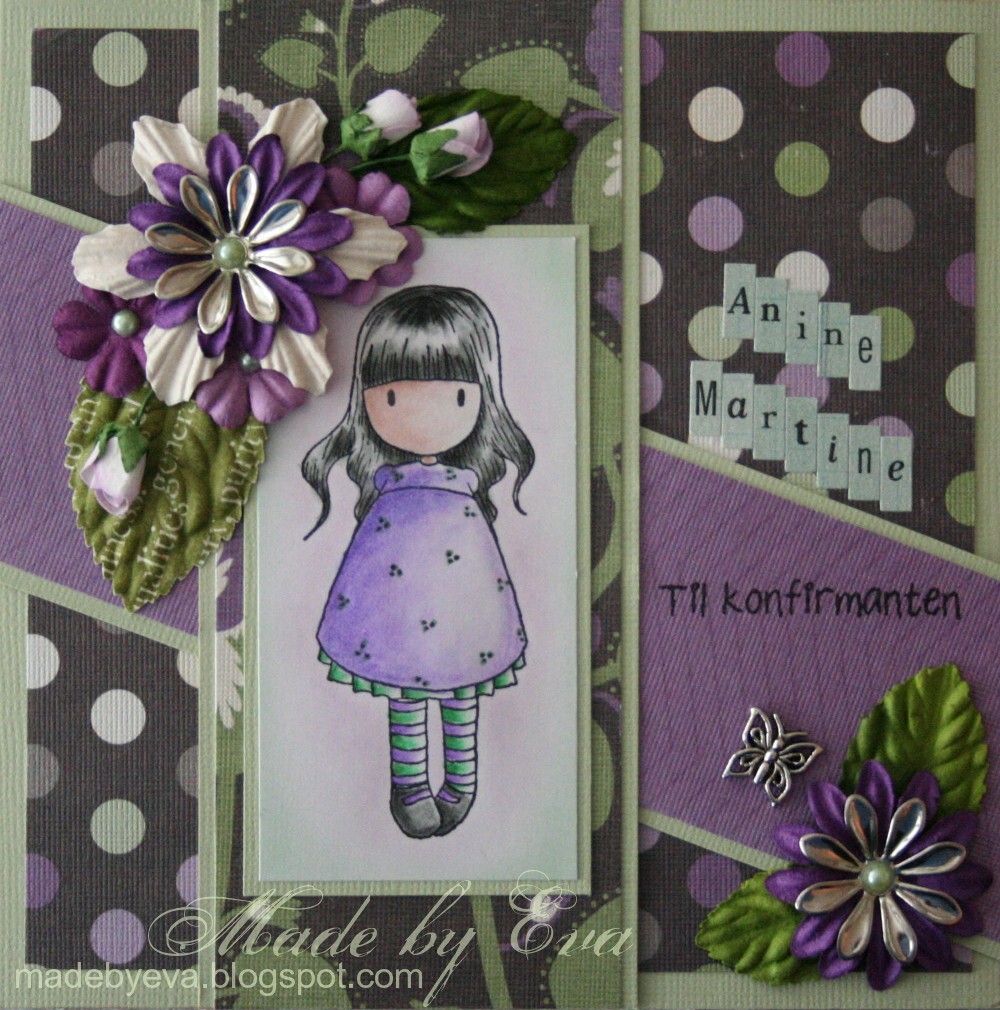 The DCVW Latte stack in action again! It's one of my all-time favourites. The confirmand's name is so long I ended up using alphabet stickers to spell it out, and I'm not really loving the look. I'm farily pleased with the rest though, I love these colours and I'm having fun making big flower clusters these days.
-
When I had attatched this sweet image to the card I suddenly thought she looked pregnant, the big skirt with the high waist line and all... Not the best role model for a 15-year-old perhaps? ;) I know, I know, it was stupid and she's obviously not pregnant, but when the thought had popped into my head it was too late and I can't really look at the stamp the same way anymore. And now I've ruined her for the rest of you. Sorry about that. ;) I only hope you can be more logical about this than me. *lol*
Monday, October 19, 2009
Place card roundup

You might recognise this embossed silver cardstock from yesterday's post. Theodor's mother and I had made these place cards for his baby blessing ceremony, and I thought it would be nice to bring something of that into the card. The place cards are quite minimalistic, but the silver cardstock gives a striking impression and we decided to show it off by keeping the rest clean and simple. She came with the silver and blue cardstock, I provided stamps, spellbinders and alphabet dies (QK Frankie skinnimini), and a few ideas. Because there were so few details (and relatively few place cards to be made), we dared to start the project of writing every name in QK letters - let's just say that that took a little bit of time... *lol* We stamped a background text stamp with watermark ink on the blue cardstock before adding the baby hands or feet in silver to give some structure to the centre. They're quite big, that's the biggest nestie die!
 Peninah, my mother and I made these place cards for Peninah's confirmation in May this year and I completely forgot to show them! I also made this and this card for her. The colours on these place cards were a nightmare get right, but they're supposed to be cool lilacs... With small greyish pink Prima flowers to give some dimension to the retro punch flowers. The names were simply written in silver (by me! o the horror) and popped up on 3D cushion tape.
 Ok, so technically these aren't place cards, but we made the place card/menu/song booklets to match these invitations, so they're fairly similar. Can't seem to find my own place card right now, so you'll have to settle for the picture I snapped before this little pile of invitations went in the mail. They were for my brother's wedding Valentine's day this year, and the wedding had a coffe theme (duh). My sister-in-law-to-be (at the time) had most of it figured out, but turned everything upside down after seeing something in the store when we went to shop supplies... *lol* I liked the way it ended up!
Saturday, May 23, 2009
One more card for Peninah


For Peninah, because girls can also get blue cards! Here's the proof. There's nothing much masculine about this card, right?
-
Again, I found a useful sketch to follow, this time from Papertake Weekly. And although I first thought that the previous sketch would be easier, I was wrong. So wrong. I loved working this sketch, for some reason everything just flowed great! Maybe other things made a difference too, who knows. My mojo is back apparently. I have to enter the card into the Colour Create Challenge as well, this colour combo is one of my absolute favourites.
-
The poem inside is a great one for a teenager, it starts like this: "Dare to be honest, dare to be free. Dare to feel what you feel, say what you want to say. Maybe those who stay quiet are more afraid than you?" It's all about finding yourself and your own way, and daring to show it - strenghts and weaknesses alike. Isn't that what the teens - and certainly the confirmation - are all about?
-
And in case you're wondering about those loose threads on the inside of the card - I'm going to tie them around the rolled-up money gift... ;)
Peninah's confirmation card


Finally done! I've ripped this card apart twice now, and this time it's just going to have to stay glued down. So there it is. Found a sketch on Sketch and Stash, and I really liked it! But for some reason my mojo was long gone when I made this card, and I struggled with it even though I instantly liked the sketch... Go figure. I'm posting it anyway - it wouldn't be fair to use the sketch and not credit the designer!
-
Stamp borrowed from Krissie - thanks sweetie - coloured with my Prismas. The dotted ribbon is new, so is the butterfly which has been heat embossed in white. Somehow the silver just didn't fit in. The inside has a pocket, and the tag that sits in it has pink thread on the reverse side for attaching money. The Bazzill cardstock comes from a set of blue/lilac colours that I've never used until we made the name cards for the table - will post them later this weekend if time permits. So for this card, that my mother has ordered, I thought it would be nice to use the same colours. Couldn't for the life of me find a pattern paper in my stash to match the colours (wow, I'm amazed that's actually possible!) , so I made my own (sort of) with an embossing folder.
Subscribe to:
Posts (Atom)