Saturday, December 5, 2009

New cabin!

Welcome to a new family member - our new cabin! Well, it's my parents' new cabin, although we all talk about it as "ours". ;) None the less, I wanted to give my parents a card celebrating the offcial handover of keys this Tuesday. My initial idea was to find a picture online of a castle (or maybe a sand castle?) overlooking the sea, but when I sat down at my desk I decided I couldn't bother turning on my computer and took the opportunity to use this cool tree house stamp instead (thanks Krissie).
-

I usually don't bother photographing the inside of my cards, but I thought I'd show you today. It's the paper I guess, the DCVW Latte stack deserves a lot of attention. ;) I keeep them fairly simple, using scraps of the pattern paper and coordinating Bazzill. Usually my decor of choice is some paper flowers (because I have to spend some of my enormous stash), but this time I couldn't resist colouring up the "congrats" stamp and stick it on. And I always leave plenty of room for writing!
-
The back of my cards are pretty standardized: either this variety with a paper scrap or two, or just my personal stamp in a couple of die-cut circles surrounded by a swirl stamp.

December 5th - Robin

So this one didn't really turn out as I had intended... Often that's just a good thing, but this LO is missing something. But oh well, what's done is done, and I haven't got time to make a new one.
-
I've tried to make the bow feel luxurious by using not only some cute lace, but two white and silver ribbons and white Scrapper's Floss (some of it coloured red) to bring lots and lots of layers into it.
-
The single digit looked a little awkward on its own, so I made it into a cluster of five fives.
-
Papers: Maja Design Vintertid: Rimfrost and I Pulkabacken
Embellishment: Ribbons from Kort og Godt and HobbyHimmelen and one onknown, Inkodo snowflake stamp, unknown snowflake stamp, white Scrapper's Floss, QK Moxie SkinniMini
Other: Silver ink pad, red ink pad

Friday, December 4, 2009

December 4th - Low season

Bergen after a snow fall... All the tables and chairs were still outside this restaurant, but not exactly useful right then. ;) I couldn't resist throwing on some flowers here and I have to say I like how this layout turned out! To avoid too much of a summer feel I chose mainly white and black colours with a rich deep red for a dramatic splash of colour. That black velvet ric rac ribbon was a last minute addition and I'm so happy it's there. :)
-
Elegant Eliza letters in shiny silver cardstock on a luxurious fabric paper letterpressed with a glossy rich red colour. The mix of glossy and matt material makes for an interesting visual impression.
-
See, there is a number on it too? I kept moving it around as it didn't really fit where I had intended it to be, and now it's almost invisible. ;) The black leaves are from half a large Bazzill flower - I bought nearly all those flowers my local store had when I heard they were going out of production!
-
I like how the flowers and black pearl swirls curve around the corner of the image. I'm training myself to do asymmetrical stuff! ;)
-
Papers: Panduro flowery paper
Embellishments: Misc. flowers from Prima, Kort og Godt, Bazzill, Prima Say it in pearls swirl, QK Eliza Mini, ribbons from Kort og Godt

Thursday, December 3, 2009

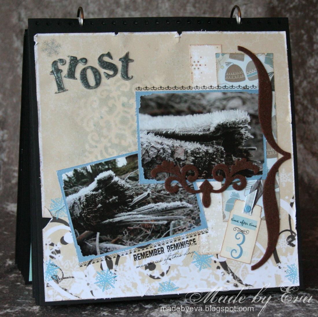
December 3rd - Frost

The morning frost had created these amazing ice crystal structures on some fallen trees one time I took a walk. They stretched over a centimeter out from the logs! You wouldn't know it just by looking at them, but colourwise these pictures were a challenge to match to papers. This worked out quite well in the end.
-
The Prima Times Alphas again, this time "frosted" with a generous spray of Glimmermist Old Lace. You can just about see the outline of the large Glimmerscreen in the bottom right corner, where I sprayed it with Glimmermist Frost (of course). ;)
-
The felt details have a subtle glisten from more Glimmermist and add some dimention to the layout.
-
These "price tags" are so much fun - you'll see more of them later. ;) For this layout I chose one without print and added a run-on and the number three in QK Katie classic.
-
I bought a rub-on pad from Art Warehouse last time at Kort og Godt and I love, love, love it! Great quality, lovely fonts and wonderful sentiments. It's been put to good use in this calendar, trust me. If I come across more varieties of these I'll buy them all! :D
-
Papers: Kreativ Hobby Vinterdrøm Symfoni, KI Memories Alpine Fashion, Basic Grey Wassail Snow Dust
Embellishments: Prima Times Alphas chipboard letters, unknown felt shapes, price tags from Bikuben, QK Katie classic, Art Warehouse rub-ons
Other: Glimmermist Old Lace and Frost, Glimmmerscreens

Wednesday, December 2, 2009

December 2nd - The dark season

I love this picture so much that I couldn't resist scrapping a page with it even if there's no snow or christmas elements in it. The fog was so amazing that morning that I skipped sleeping after my night shift to photograph instead! Never regretted it one single second! :D I figured I could get away with this picture in the advent calendar by placing it among the very first LOs - after all, there's usually no snow at this time of year anyway. That's my story and I'm sticking to it. ;)
-
I found a tutorial on Stampartic showing how to make these flowers with your Retro punches. I'm unable to link to it (make a title on your post ladies, so we can link to it!), but here is another tutorial. The biggest Retro punch is now on my wish list for Christmas - I would have loved to make these flowers even bigger.
-
Whenever I have to use the Norwegian letters æ, ø, or å, I've only got three choices among my alphabets. Frankie is a favourite. :)
-
Materials used:
Papers: DCWV Latte Stack, Creative Inspirations Indigo Crackle
Embellishments: Retro punch, Kort&Godt ribbon, Spellbinders tag die, QK Frankie SM
Other: MS Arched Lattice border punch, Cuttlebug corner punch

Tuesday, December 1, 2009

December 1st - Advent

Welcome to the first presentation of my advent calendar! This will be a daily event, one layout revealed each day until Christmas Day. It's been a labour of love, this thing. I'm glad it's over and extatic that I actually managed to get it done, and I've been longing to show it off... ;)
-
This page has time as its main subject. Today is the start of the count-down, the waiting period before the great celebration. The clock hands were coloured using a silver ink pad and PearlEx Grey Lavender, sealed with a coat of Glossy Accents. I have to say I prefer the Perfect Pearls powder...
I knew I wanted this LO to be purple, as that is the colour associated with advent in the church. Fortunately for me, I found one single winter themed pattern paper in purple colours in my stash!
-
The letters looked a bit boring, so I tilted the "e". I'm pretty sure I've lifted this trick from a logo or something... Twinklin' H2O's and Perfect Pearls powder gives the large Prima Times Alphas that colour and shine.
-
This is the only LO where I wanted to write something more than a title. It's a common misconception (in Norway, at least) that advent means "waiting period". In fact, "Adventus Domini" means "The Lord's Arrival". I still like the thought of advent as a waiting time and wrote a short text, using both terms in their correct meaning. Obviously, advent started last Sunday and not actually today, but this calendar has to be usable year after year... ;)
-
Materials used:
Papers: The Paper Company: Snowflake Medley, unknown purple PP, Panduro embossed silver paper, Hambly Frosty Snowflakes overlay, Bazzill, unknown purlpe sparkly paper
Embellishments: Scrap FX chipboard clock hands, Prima Times Alpha chipboard letters (large)
Other: Twinklin' H2O's Mulberry and Dutch Iris, silver ink pad, Perfect Pearls Interference Violet, PearlEx Grey Lavender, Glossy Accents

Saturday, November 28, 2009

Advent calendar

Some time ago I gave you a little sneak peek into a huge project I had started, not really knowing whether or not I'd be able to finish it in time for December (this year). I'm extremely pleased to say that I am, in fact, done! :D
-
So this big project is... *drum roll* ...my advent calendar! I've scrapped one 12"x12" layout for each day in December up to (and including) Christmas Day and glued them into a canvas-backed book. Similar to a December Daily except I've already made everything and is just showing it off now. ;) Today I'll show you the basic structure of the calendar. Starting Tuesday (December 1st) I'll show you one layout each day until Christmas Day. Today I'm just giving you a sneak peek at all the pages as I had them spread out on my table sorted into the desired order:
-
I'm fairly pleased with the overall results! But please forgive the quality of some of these layouts as they come along through December - I've never scrapped anything in my life before this, although I suppose the card making has given me some relevant experience. Some layouts turned out great, some... not so great. It takes all my strength to not go back over some of these layouts and doing them all over again. ;) So, what you'll see are my very first attempts at paper crafting in this format. They won't be shown in the order they were made, as I first made them all and then sorted them in the order I wanted them to be in the calendar.
-
I've learned a few things during this: Firstly, 25 scrapbooking pages takes up a lot of space. This is the finished calendar compared to the original base without decoration. Obviously the spine had to go, and I struggled to find something to replace it with. The solution (at the moment) is to use some relatively long strands of ribbon to hold it together when stored, and adding two jump rings to compress the spine when it's displayed to make it stand upright better.
-
Secondly, glitter goes everywhere. It's in my face, on my clothes, on my bathroom floor. I'm supposed to be an adult and not a messy four-year-old, but I can't help it. But glitter makes any page pop, so glitter there must be. ;)
-
Thirdly, I'm bitten by the bug. I want to make more. More. More! So I suspect that a similar calendar for the rest of the year is coming. Not one layout for each day just yet though, I want to live a little as well. ;) But perhaps one per week? I've already got several photos ready for the task!

Sunday, November 22, 2009

Another long term project

I've started another long term project. Really long term. If all goes well this will make a couple of gifts in February. I'm having a go at making my own vanilla extract! Exciting and something completely new for me. Occationally, I'll find a recipe asking for it but since I've never had something like that in my cupboard I've just skipped it or chosen another recipe. The vanilla essence you'll find on the super market shelves is just revolting stuff, trust me. This is the real stuff - made from lots of vanilla pods (seeds and all).
-
It's looking a bit dodgy in this picture, as I had just shaken the jar and some of the seeds were still floating around in it. They sink to the bottom so the mix turns clear and clean. In two months or so I'll decant about two thirds of the extract into small bottles to give away. The last third will make the base for another batch - I'll just refill the jar with vodka and keep adding vanilla pods now and then.
-
There are several recipes online, I've used this one from Craft Magazine.
Check back in a couple of months and I'll share the results. ;)

Wednesday, November 11, 2009

Randi 60 years

I often go for vintage style cards when making cards for this age group, but somehow it just didn't seem right for Randi! She needs to get something in bolder brighter colours, something that suits her personality better. You may recognise the BG Wisteria paper pad - again... Yes, I know, I'm addicted.
-
I've coloured the stamp with Prismas as usual. The Prima chipboard numbers are painted with H2O's - they are more blue in the picture than in real life although I didn't manage to match the colours as well as I would have hoped. A bit of lace and a few paper flower buds later and the card was done.

Monday, November 9, 2009

Knut 60 years

I have to admit this is a recycled idea... But cards for men are so difficult, and he loves nature, fishing and dogs so this was just perfect for him! That's my story and I'm sticking to it. ;) The card is all about texture, with several layers of various structured paper. Wooden buttons and paper leaves is the only other decoration. It's still almost too much... Oh well. I think he'll like it. ;)

Friday, November 6, 2009

Wisteria and Miss Anya

This is the last of the cards I made at HobbyHimmelen on Saturday.
Most of the BG Wisteria paper pad has soft, pale colours. But now and then some strong bold colours show up! Like these. The richness of these colours make them a joy to work with, and I decided they were best suited for a card with clean lines. Miss Anya was coloured with Prismas as usual. Black hair is a nightmare to colour, even worse than blonde! I certainly cause trouble for myself... From now on I'll always use colours that suit brown hair. *lol*

Wednesday, November 4, 2009

Vintage angels

The BG Porcelain paper pad has been put to good use again! Along with a pink square from the Two Scoops pad. Brown and pink has got to be one of my favourite colour combos... Other matierials used are MS doily lace border punch, Prima Hydrangea flowers, Kort og Godt roses, misc. hardware from stash, brown Scrapper's floss, a rub-on ("love you") from Ett Trykk and Creamy Brown chalk ink.
This card was also made at HobbyHimmelen on Saturday, for a sketch challenge that day. The day was awesome! I'd certainly like to do it again.

Tuesday, November 3, 2009

Dream in pink!

This card was made for a sketch challenge at HobbyHimmelen on Saturday. I had already made one and was running short on time, so it was rushed a bit, I'm afraid...
-
The papers are from the BG Two Scoops paper pad, ribbon from Kort og Godt, giant rub-on from K&Co, EK Success border punch. Image coloured with Prismacolor pencils - and I've realised that blonde hair is really difficult to get right! The pink flowers came in a give-away from Stephanie. Thank you so much, they're lovely!

Monday, November 2, 2009

Spots 'n stripes Wisteria

My BG Wisteria paper pad is getting thin... I just love them so much!
-
Papertake Weekly asks for spots and stripes. The stripes should be fairly obvious, and the darker paper have flowers made from spots and circles. I've used half a Bazzill paper flower again and sprinkled other flowers around. The image is coloured using Prismacolor pencils and the flowers have been lightly sprayed with Glimmermist Pearl.

Sunday, November 1, 2009

Vintage card

Finally, a new card! I've been so occupied with my December project that cards have been a rare commodity around here lately. But I've got five more lined up for the next few days. The reason for this is the 12,5 hours I spent scrapping and cardmaking along with several wonderful ladies at HobbyHimmelen yesterday! So much fun! Although I almost regretted it when I started choosing and packing what to bring the night before... *lol* I hope to get the chance to do it again - they just have to stop organizing these events whenever I work the weekend. *sigh* And now for the un-packing...
-
The papers are from the BG Porcelain pad. I've inked the edges with Creamy Brown and also inked the entire surface of the picture (found online) to give it a sepia feel. Then layered a cut Bazzill flower with a cream flower and pale pink roses and rosebuds. I also used my Spellbinders labels four that I just couldn't resist buying yesterday...
-
This card is going into the ABC Challenge (green) and the Our Creative Corner Challenge (vintage). It's been a long time since I've entered a challenge - perhaps I'll get some beginner's luck back? ;)